Defining a Pattern Library
I led the effort to establish a pattern library when I worked at Namely, an enterprise HR software company.

For such a complex product with over a dozen features and a growing design and engineering team, a pattern library provided value in many ways:
- Maintain a consistent experience across all platforms that upholds standards of usability and accessibility
- Improve communication between teams with a shared vocabulary
- Increase stability and performance of the codebase
- Enable faster prototyping and development
- Eliminate duplicate work for designers, developers, and QA alike
You can find more UI elements documented here, but for this article I go on to write specifically about overlays.
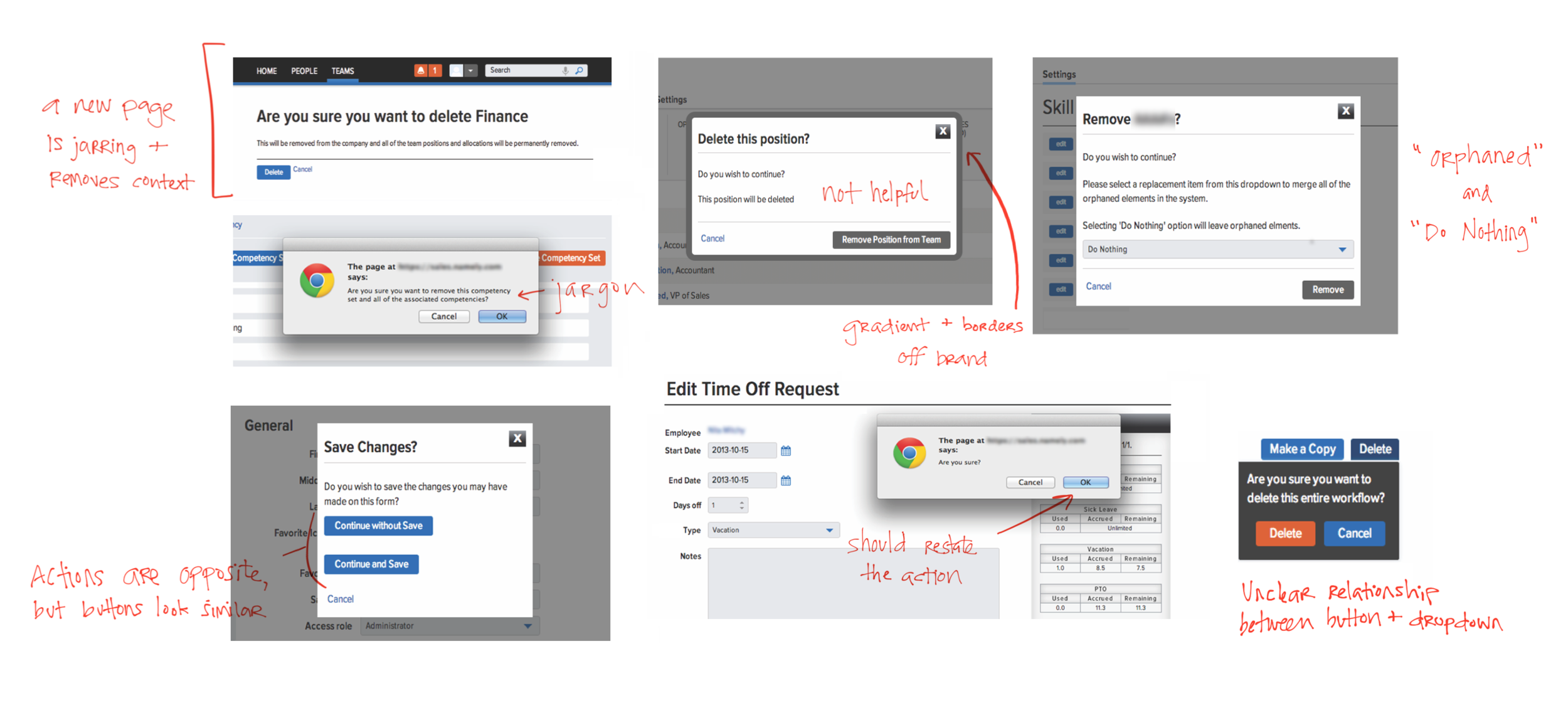
I chose to write about overlays because I found several irregularities in the application of overlays, design, and language.

When determining guidelines for overlays, I looked at examples from other products for inspiration and consulted articles to ensure I applied the best standards for usability. I also collaborated with other designers and front end developers to ensure scalability and technical feasibility across all platforms.
And here’s the documentation we came up with:

Tooltips
Purpose: Use to display auxiliary information for non-experienced users. For example, an info icon on a form explains why your SSN is needed to file taxes.
UI: Tooltips are small and unobtrusive, since users opt in to see the additional content. The dark silhouette provides stark contrast against a light background.

Dropdowns
Purpose: Use when the user must provide more information in order to complete an action. For example, before deleting such-and-such parent item with child items, you may move child items to another parent.
UI: Dropdowns have the same dark color as tooltips, but they are larger and more robust, possibly including multiple text styles, form fields and a buttons. The dropdown is in close proximity to the action that produced it (i.e. “delete” or “update”) to convey their relationship.

Modals
Purpose: Use when the user is required to complete an action. For example, you are warned if you navigate away from a page with unsaved changes.
UI: Modals are prominent, obscuring anything else on the page behind a full screen dark scrim to focus you on the issue. The length of the content must be short to avoid scrolling.