Namely Case Study
Namely’s mission is to help mid-sized companies build a better workplace by offering an all-in-one HR platform, including payroll, time tracking, benefits, and performance.
I joined Namely as the second designer back in 2013. In my 3 years there, our tiny department grew to include 5 designers (meanwhile the rest of the company grew immensely to include 10 product managers and over 70 engineers).
Despite not having any prior knowledge of HR when I joined, I was alway curious and stopped to ask “why” first. I conducted user research, collected feedback from stakeholders, and worked alongside with product and engineering partners in order to gain deeper insight.
I go on to describe the process for designing the General Ledger project and how gathering feedback from users early in the process keeps the focus on features that will bring the most value.

General Ledger
ROLE
Research, UX, UI
WHEN
2017
TEAM
1 Product Designer (me)
1 Product Owner
3 Engineers
1 Project Manager
1 QA Analyst
PLATFORM
Web
Problem
Creating ledger reports is a manual and time-consuming process which requires users to communicate specs to account managers, which are then translated for developers to implement.
Solution
The goal is to make a tool that empowers users to easily extract financial data and make informed decisions.
Execution
Throughout the iteration process, I consulted multiple sources to guide my decisions. Here’s a summary of the types of data used in my findings:
INTERVIEWS
I interviewed subject matter experts to learn about their ideal ledger report, their current workflow, touchpoints in various individuals, which tools they used, and any points of frustration.
Quantitative Data
Developers extracted the most common report configurations collected from the past year. I was cautious to offer users too many report types in the new tool, since discerning differences between the choices demands a greater cognitive load, so I sketched multiple concepts.

Usability Tests
The next step is to seek validation from users.I selected users with experience in finance to perform various tasks using a low-fidelity prototype. I prefer conducting early rounds of usability tests in person so that I can follow up with questions. Two interesting observations came to light:
Findings
Participants skipped over the “Display Settings” section (where you define how data is aggregated). When I pointed this out, subjects stated they would rather manipulate data in Excel, so they want reports with as much data as possible.
Participants spent a short amount of time on the “Preview” page. Since the “Display Settings” weren’t valuable, neither was a “preview” of those display settings. Subjects stated they prefer a preview that ensures their credits and debits balance out.
Based on these insights, we decided to remove some of “display settings” and hold off on the “preview” since the credit / debit validation requires more investigation.
More Usability Tests
Once we’ve determined which features will go into the next release, I performed additional rounds of usability tests (using UserTesting) with a high-fidelity prototype with a goal to ensure the interface is intuitive and easy for the average user. Simultaneously, engineering started implementing major pieces of functionality while I am polishing the visual design and UI copy.
Challenges
Staffing changes disrupted continuity.
Last minute decisions to pare down of scope cascaded to changes in the designs. It also caused confusion around what are “finalized” designs.
QA analyst was involved late in the process, so ramping her up took extra time.
Here are some additional projects I worked on during my time at Namely:

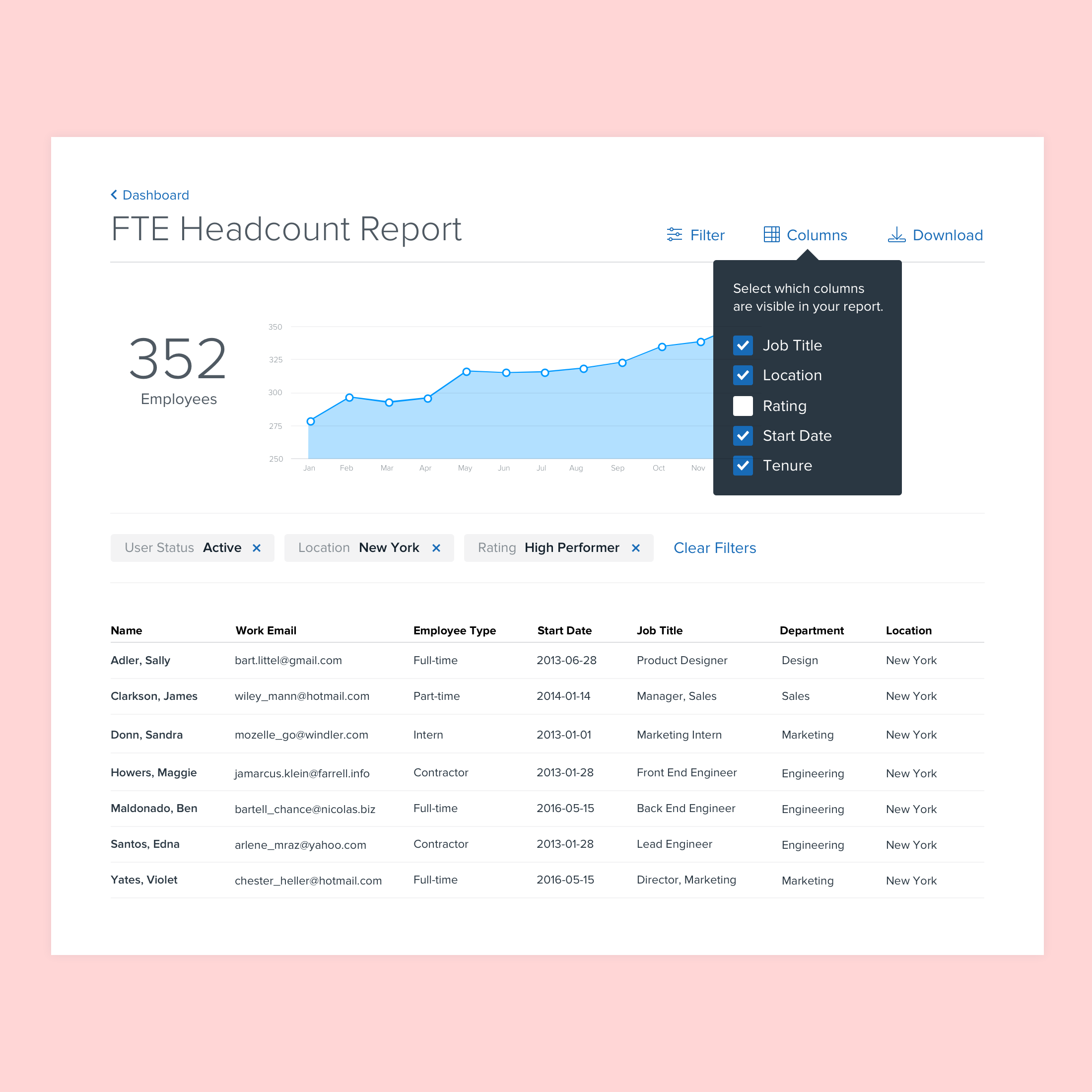
Reporting Engine
When: 2016
Problem: Users found the reporting beta feature launched in 2014 to be complicated and confusing. While it offered robust functionality, such as generating a report with any combination of employee data, there was a high learning curve which hindered usage.
Solution: Offer premade report templates with limited customizations based on relevant combinations of employee data. I worked with a business analyst to derive the most commonly generated report types based on user interviews and platform data from the past two years.

Workflows
When: 2013
Problem: Companies require an approval process for most employment decisions (like promotions, hirings, and firings). However, the existing platform had simplistic permissions around who can modify fields like salary, job title, employment status. Plus, there was no visibility into who made these changes.
Solution: Allow companies to configure multi-step and multi-role approval processes for different events. Additionally, provide an audit trail that captures who requested and who approve the changes.